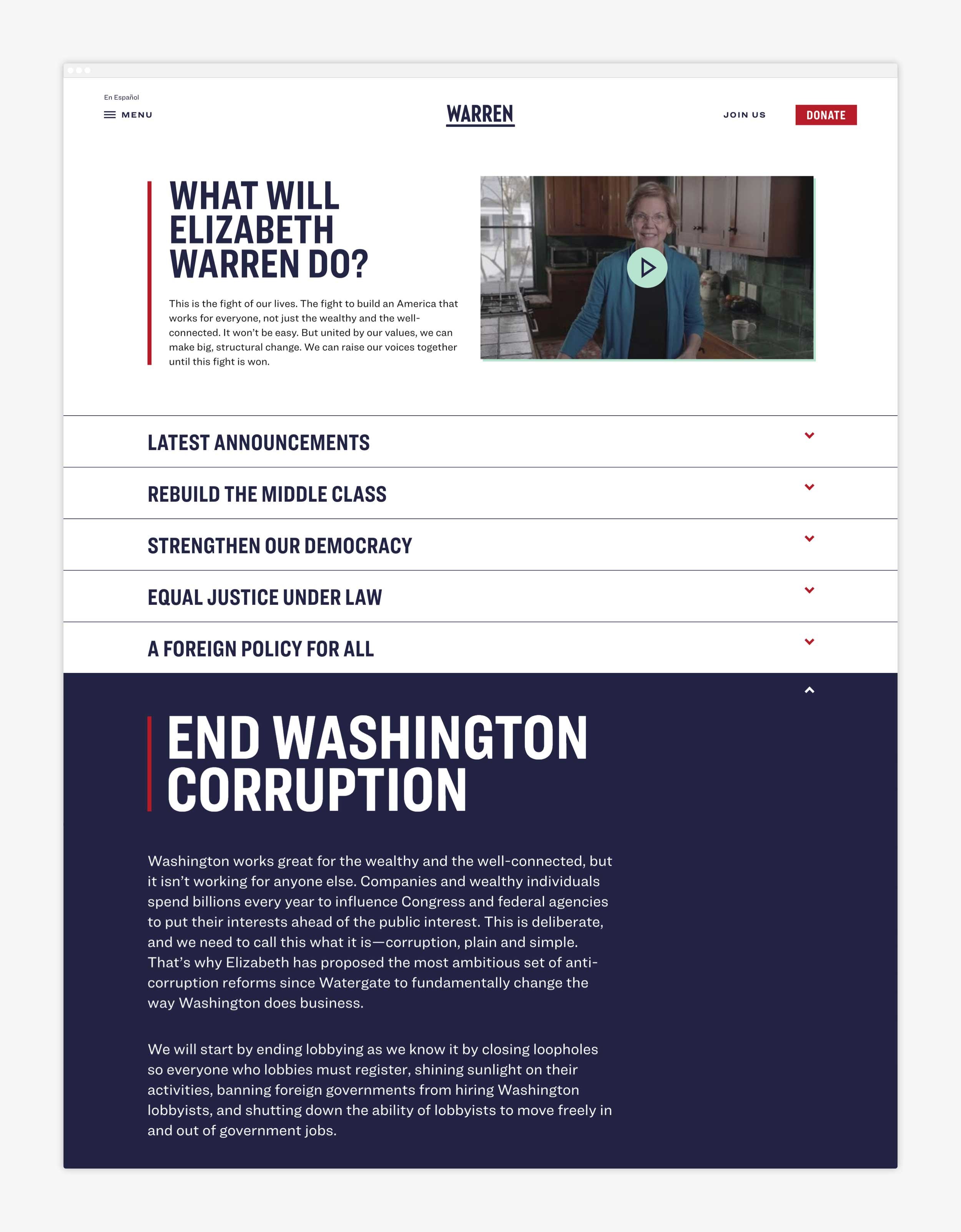
Warren For President
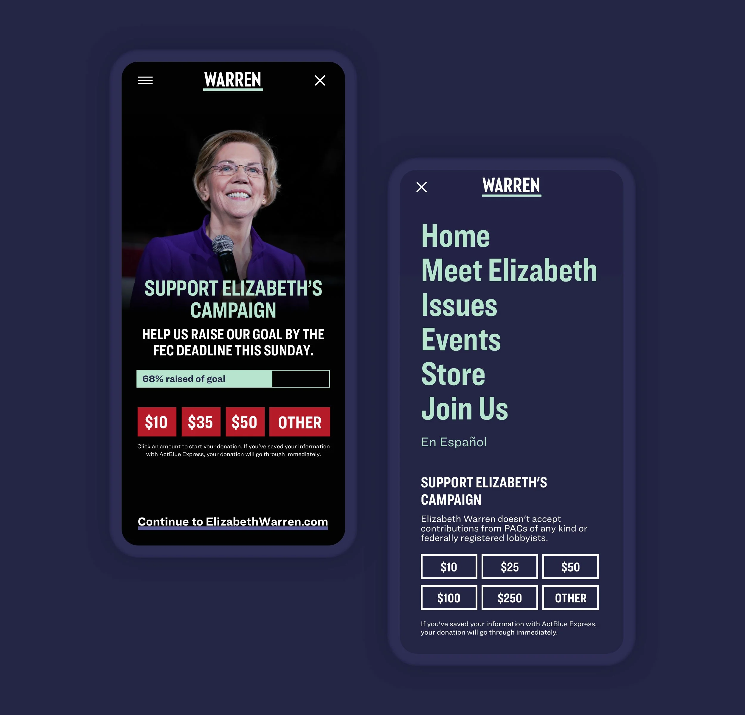
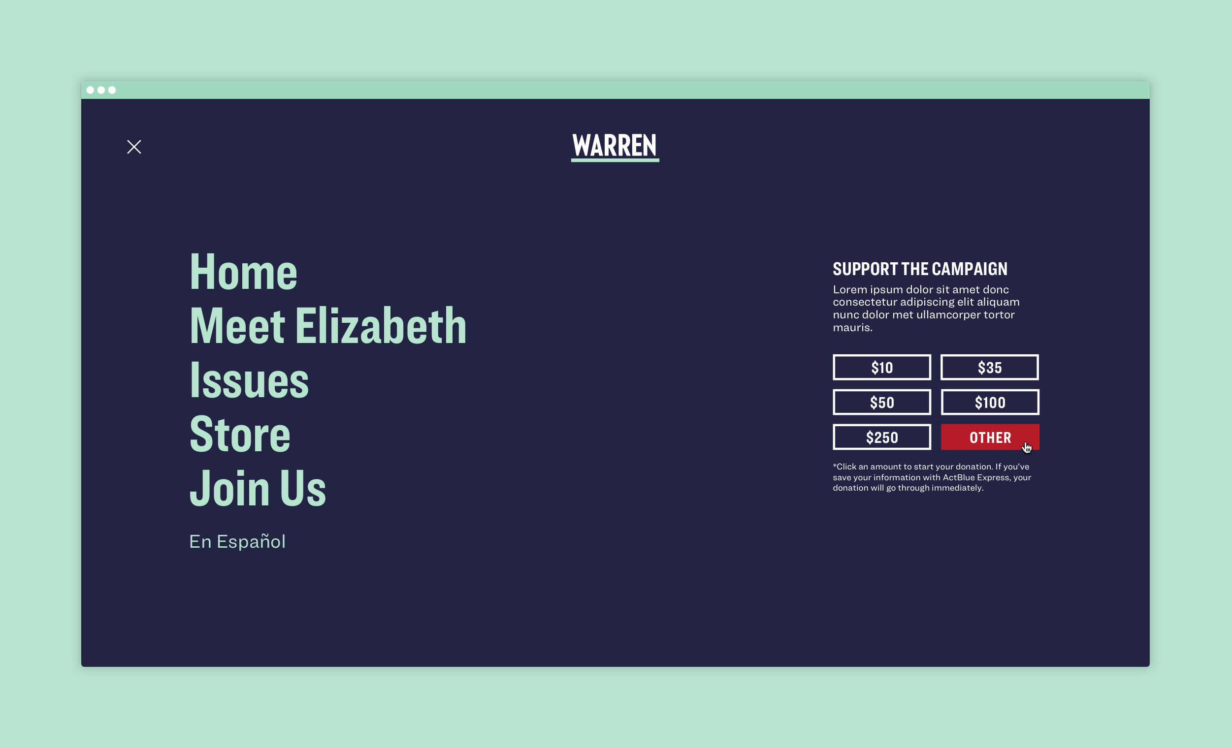
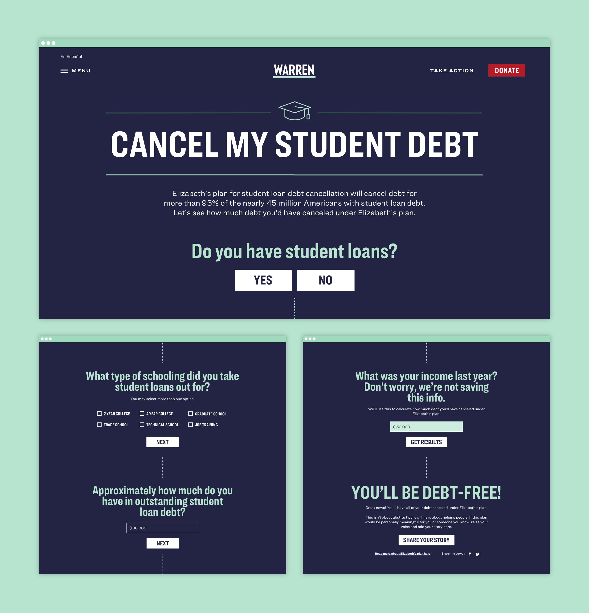
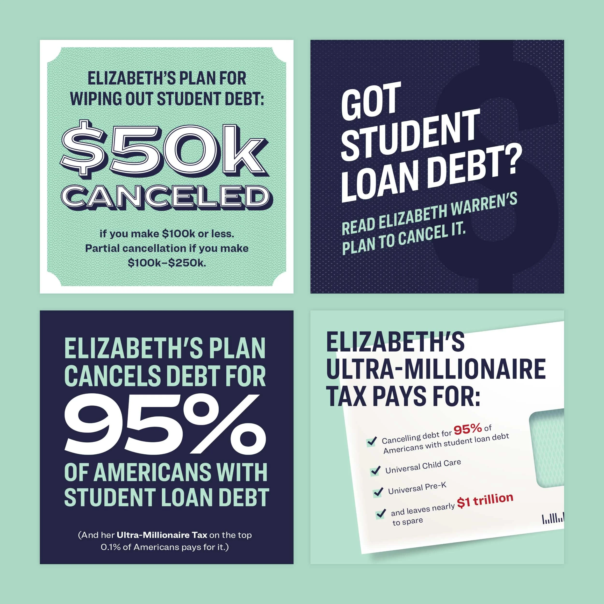
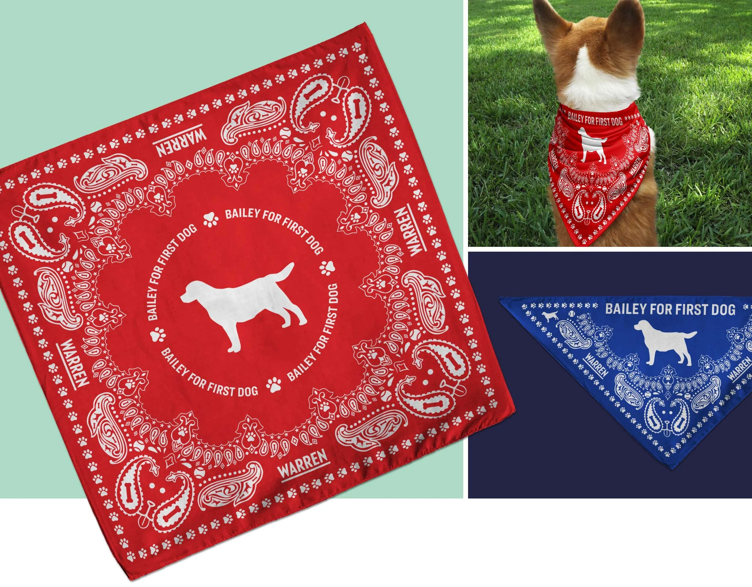
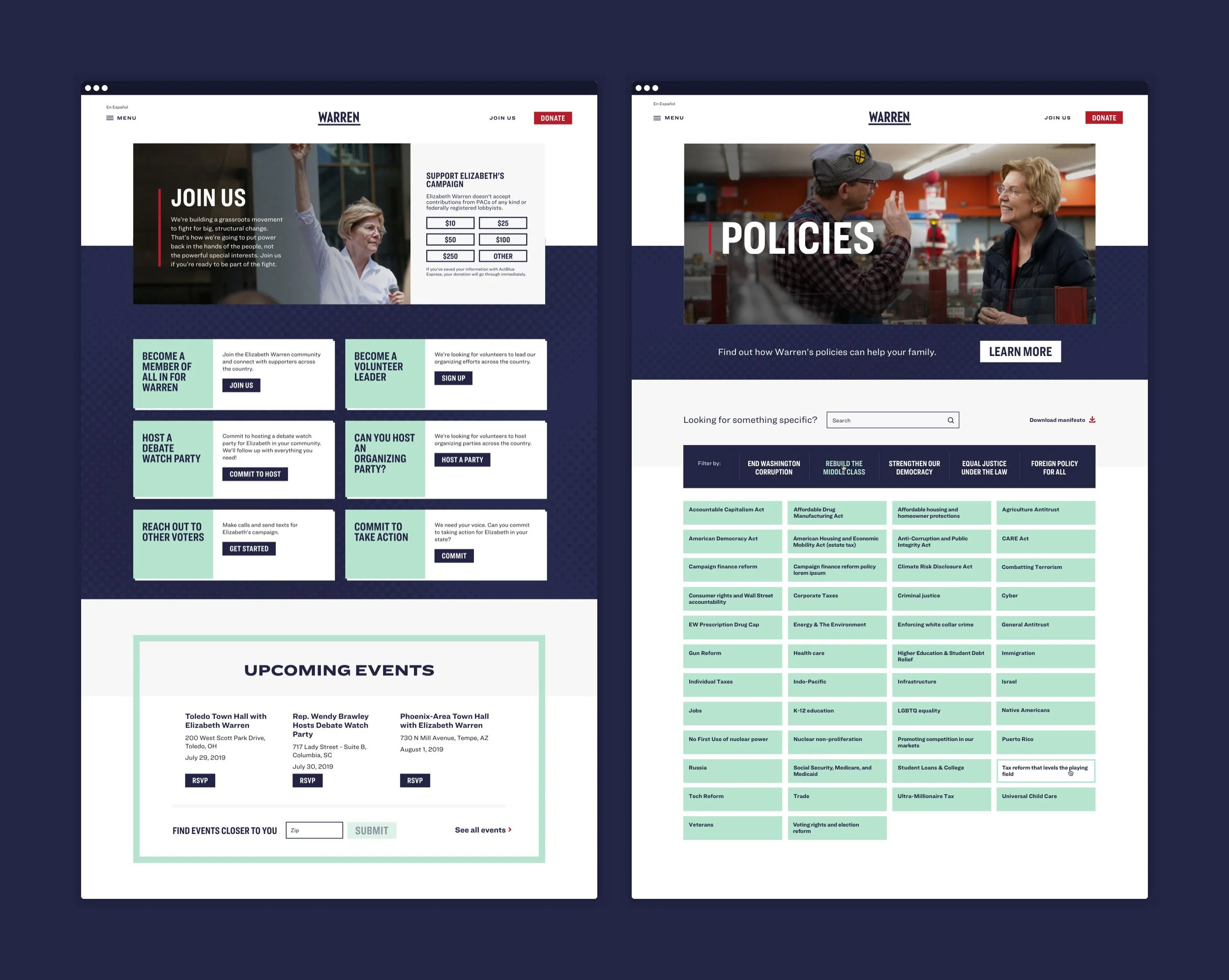
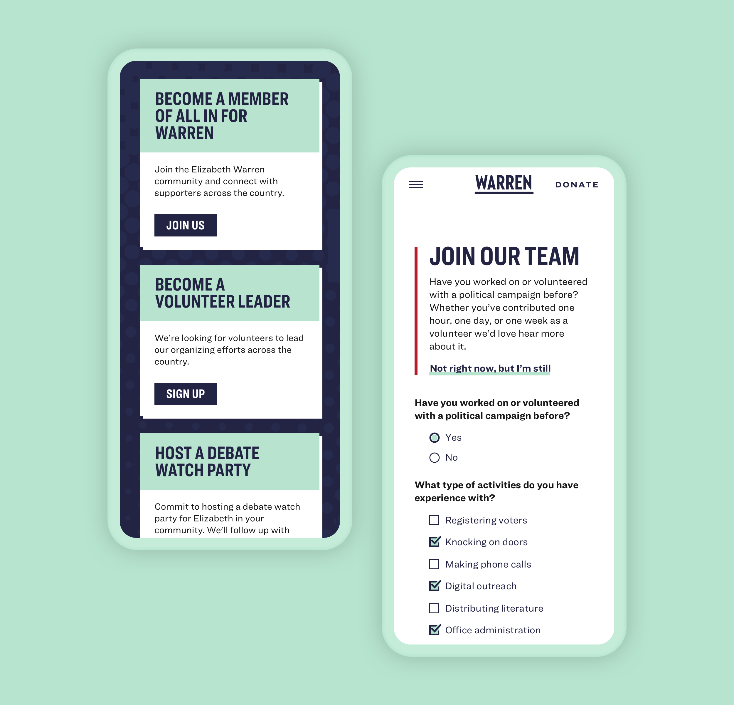
I was instrumental in shaping the foundation of Elizabeth Warren’s campaign visual identity in collaboration with Blue State’s Executive Creative Director, Matt Ipcar. I contributed to the development of the logo, was responsible for defining the Warren typographic and color system, designed the campaign’s launch site, created collateral and merchandise, and helped steer brand consistency as the campaign staffed up internally.

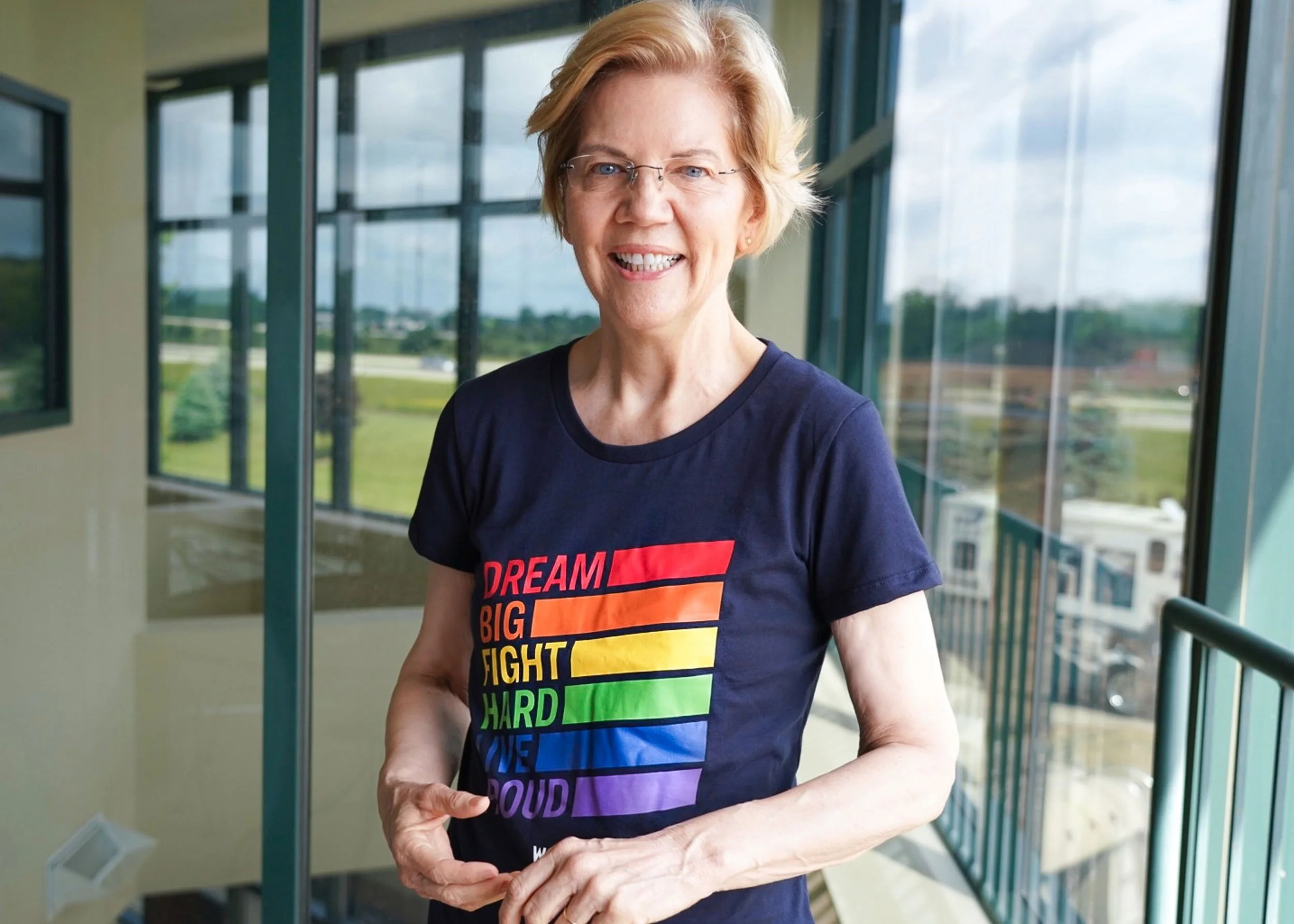


“Dream Big Fight Hard” lockup in-situ
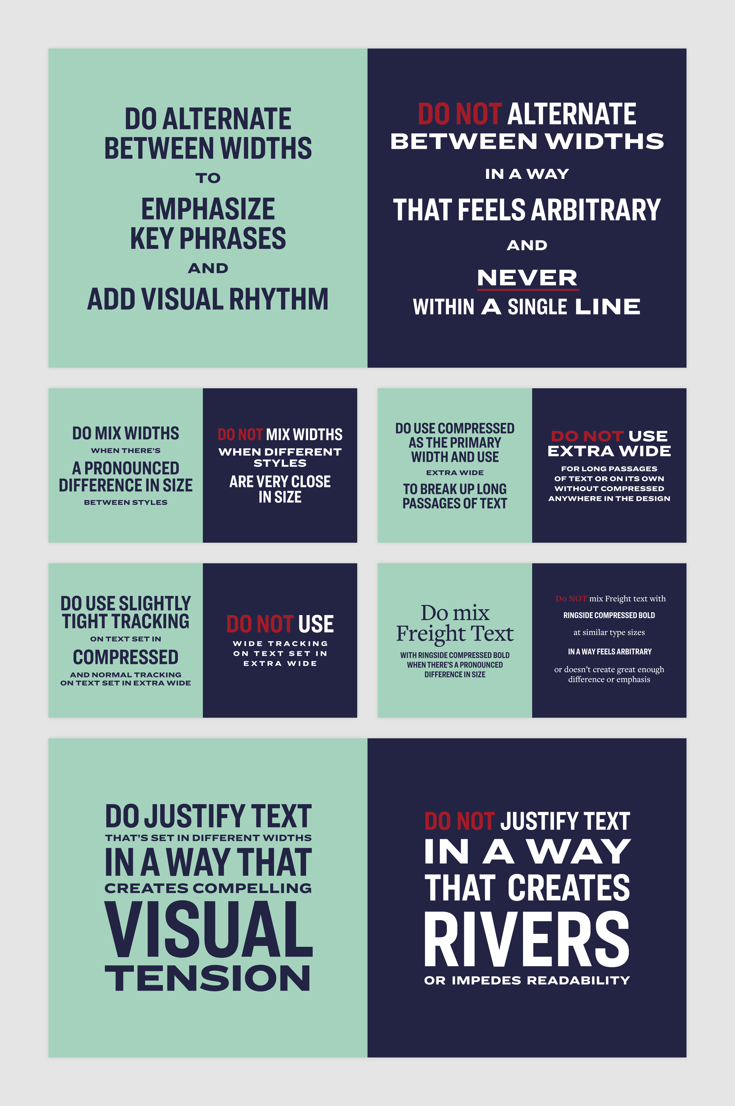
The brand typographic system employed the Ringside and Freight Text superfamilies. With a large design team and involvement from grassroots supporters, it became necessary to establish—and illustrate—clear guidelines around usage, especially given the nuanced way in which we mixed the compressed and extra wide widths of Ringside.